And a big part of doing so has to do with Implement Interaction Design. In the highly competitive digital sphere, providing the best user experiences is the key to building lasting relationships with customers.
Below, we will discuss the concept of interaction design, the value it brings to businesses, and tips on how to implement good interaction design.
What is Implement Interaction Design?
Interaction Design refers to the relationship between a user and a product or service. This involves creating engaging interfaces that allow users and a product/system to communicate with each other. Essentially, it is the creation of a dialogue between a user and a product, system, or service.
The elements that come with Interaction Design can be broken down into five dimensions:
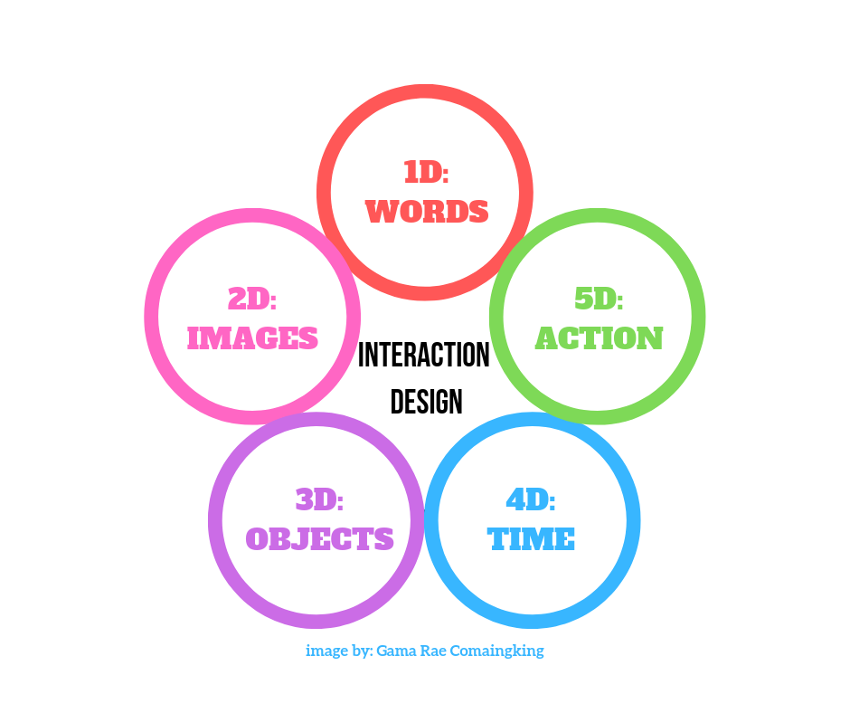
The Five Dimensions of Interaction Design
In order to understand the concept of interaction design, it’s important to talk about the different aspects involved in designing interactions. These dimensions are the backbone of interaction design principles, which allow for seamless interaction between users and technology.
1D: Text or Words
These are used to convey information to users. This can be a block of text, button labels or anything that relays information. It could be as simple as a page header that says “About us,” a button labelled “Submit,” or the information on a product page.
2D: Images or Visual Representations
This refers to the graphical elements like images, typography, icons, which not only grab users’ attention but aid user interaction as well. As users have become visual beings, this has grown increasingly important in grabbing and holding users’ attention, as well as conveying messages.
3D: Physical Objects or Space
Physical objects refer to the medium through which users interact with a product. For example, a trackpad for a laptop, and fingers for mobile phones.
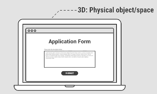
Meanwhile, space refers to how text and visuals are presented. Too much graphics can confuse the user, while too little can bore them. The same goes for text-based information where the designer must arrange them in a logical manner that allows information to be processed as easily as possible.
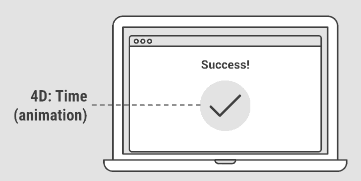
4D: Time
This refers to media that changes depending on processes such as animations, videos, and sounds. For example, a checkmark animation that appears after something has been downloaded, or the sound that plays when Windows boots.
This is important because it gives users feedback that a particular process has either been successful or not.
5D: Behaviour (Action)
Behaviour refers to how all the previous elements worked together to influence a user’s interaction with a product. This dimension also carefully considers user feedback, which is used to improve the design, functionality, and – ultimately – user experience.
Three Important Principles of Interaction Design
- Hick’s Law According to British psychologist William Edmund Hick, the more choices a person has in front of them, the longer it takes to decide. While having options may be considered good in other fields, in Interaction Design, this can lead to confusion.E-commerce giant Amazon applies this principle by limiting the number of options on their home page. Additional options are displayed as text or buttons, while their search feature is highlighted at the top.
Good interactive design follows this principle to simplify users’ decision-making process, thus improving their overall experience. - Fitts’ Law
This basically means that the amount of time needed for a user to move a cursor or pointer is affected by how far away the objects are and how small they are. In Interaction Design, it means that smaller buttons are harder to click and objects farther away are more time-consuming for users to click. Therefore, buttons should be larger and related tasks should be kept together for efficiency. Google applies this principle by making their icons big enough to reduce error, and the distance between icons small enough to save time. - Tesler’s Law Tesler’s Law or The Law of Complexity Conservation states that in any system, there are processes or complexities that, after a certain point, can no longer be simplified. In Interaction Design, it basically means moving complexities to the back-stage processes, away from the user. Airbnb applies this principle by presenting users with simple tasks like searching for a place, choosing dates, and indicating the number of guests before moving on to more detailed processes. Applying the concept makes guiding users along the process easier, promoting a product’s ease of use.
Interaction Design Best Practices
- Make Actions Simple to Discover It’s been said that if users cannot see it, it doesn’t exist. This is why it’s important to make sure users are able to quickly understand what they can do. Apart from making available interactions easy to find, it must be made clear what actions are possible. In the examples below, LinkedIn, NPR, and Facebook labelled their icons to ensure there’s no confusion as to what users can do. It’s your job to make the interface understandable, not the other way around. www.toptal.com
- Add Implied Signifiers Speaking of possible actions, use signifiers whenever possible to provide users with clues that indicate an available interaction. In desktop web browsers, for example, a hand cursor is a universal signifier that an element can be clicked, while an i-beam cursor indicates that text can be selected.But with the absence of cursors, it’s more complicated in mobile design. What designers have done is to optimize mobile UX is to feed into users’ experiences with touch screen interfaces as you can see with the common gestures below.Using these common gestures on your products minimizes the need for learning, making it easier to use.Blending labels, colour, and icons are also common signifiers in mobile design. It’s important to note that if you want users to become familiar with your signifiers, it must be applied throughout the Interaction Design consistently.
- Provide Feedback Feedback lets the user know what the impact of an action is. Facebook, for example, lets users know that the file being dragged from the file window can be dropped into the area with broken lines. There are also text like drop photo/video to inform the user of the process. Providing feedback, however subtle, whenever an action is completed is important in signalling to the users that they can proceed with the next step in the process, and takes away the guesswork in using your product.
- Use Natural Mapping Closely related to feedback, a mapping is establishing a clear relationship between controls and its effect on a product/system. So when you combine feedback and mapping together, you provide users with a seamless experience. For example, a slider intuitively tells users that sliding it to the right will increase value while sliding it to the left will do the opposite. This was how it worked back when physical stereos were around. But it’s become such a universal function that even those born after that era are familiar with how it works. The first image below is an example of poor mapping, as it makes it difficult for users to determine which controls operate which stove burner. You can see the difference in the second image which makes it perfectly clear which controls are for which burner.Utilizing natural mapping plays into users’ intuitive nature, which translates to a product that’s easy to use.
- Limit the Users’ Options with Constraints
In an application of Hick’s Law, constraints limit users’ options when it comes to available interactions. This makes for more efficient interactions as it guides users towards certain actions and makes them focus on important tasks.For example, Landbot.io has only 5 options on its homepage: login, sign up, create a bot and more information. This guides users towards their main product, which is creating bots. Putting in these types of constraints also lets you nudge them towards your call to action. - Practice Consistency Be it signifiers, icons, or gestures – you need to make sure that it remains consistent throughout the product. Consistency reduces the need for learning and eliminates confusion – key aspects of good user experience.
- Create Patterns that Inspire Learnability Speaking of reducing learning, using components users are accustomed to making a product that much easier to use. For example, unless you can come up with an element that provides significant improvements over what came before it, stick to familiar UI components like buttons, text fields, dropdown menus, checkboxes, etc.
- Emphasis and Visual Hierarchy Visual hierarchy is about arranging elements to imply importance. Users want to get the information most relevant to their search, so you need to make sure that your visual hierarchy is able to reflect that. You can place emphasis by creating visual contrast by altering things like size, proximity, and colour between elements.
Conclusion
Interaction Design consistently evolves and innovates to accommodate progressing technologies. With the ongoing development of technology, creativity becomes one of the key elements in developing your product, brand, and reputation as a business.
To stand out from your competitors, it helps to create a perfect balance between these elements and features, while also following key principles and standard practices to ensure your users get the best experience possible.