We are surrounded by writing impact UI be it in the form of news bulletins, articles, emails, listicles etc. both in the physical and virtual world. It is in this regard, that messages need to be universally understood by everyone irrespective of who is reading them.
In this article, we’ll discuss if writing impacts UI and also touch on how to curate your content so that it helps in the growth of the brand.
Importance of Written Language in UI
Content and web design always go hand-in-hand. And as the saying goes, ‘content is king’. When we talk about UX or UI we are talking about everything on the website – the images, the page design and yes, the content!
The more engaging and user-friendly the content, the more readers would be interested in spending time on your website. Good content thus is vital as it can take you and your brand places.
However, oftentimes we forget the basics and end up writing stuff that sounds better in our heads than it does on paper!
Below is a list of 5 things to avoid for a better UI:
- Use of Jargons
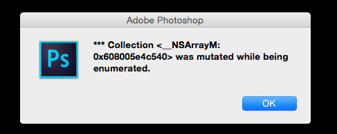
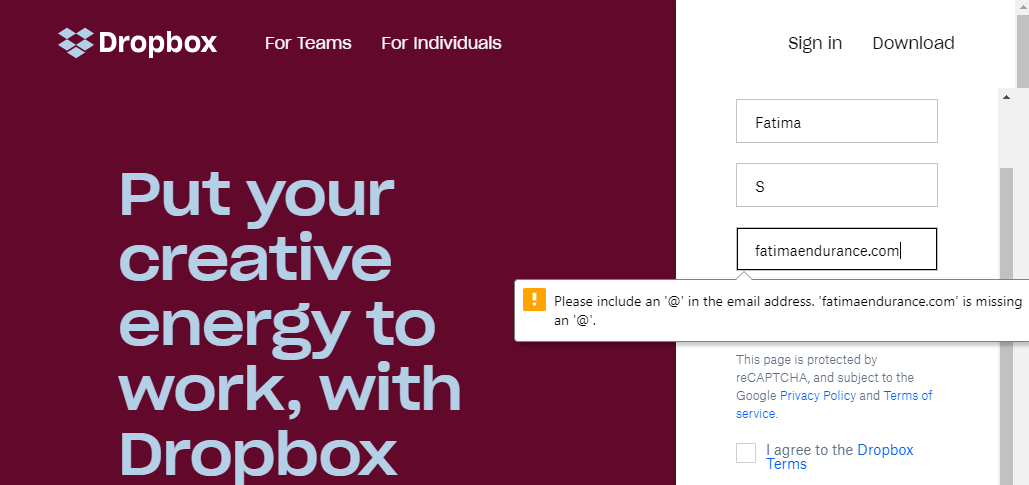
Jargons (or confusing complicated words) increase the risk of users losing interest in a website. Words used should be clear, accurate and precise as they can either build and break the brand.One of the most common places where web developers or designers tend to overlook this is the error message/page that pops up whenever a page isn’t loading or a file is missing. A quick tip would be to re-read the message from the perspective of a layman who doesn’t understand technical words and can get confused if things are not explained well.Below is an example of jargon used in a message and a better way of explaining too:
Error Message with Technical Jargon 
Error Message Explained in Simple Words - Long Wordy Sentences
Writing a long sentence doesn’t mean that a user will stop and read. On the contrary, he/she might simply skip reading. It is very important to keep sentences short and concise. This keeps the user engaged and at the same time provides important information upfront.In most cases, it’s not necessary to describe every detail in the first interaction. It’s better to reveal increasing detail about features when the user explores them and actually needs the information. A good thumb-rule is to put yourself in the customer’s shoe and analyze if the content is really relevant or you can do away with a few details. Force yourself to focus on what is absolutely relevant and convey that as clearly as possible.For example:
Wrong Sentence: Send and receive money in a hassle free way with the use of Western Union. All you need to do is create an account and pay with credit or debit card, cash or Apple pay.
Recommended Sentence: Transfer funds to anyone across the globe with Western Union. It’s fast and simple. - Skip Unnecessary Punctuation
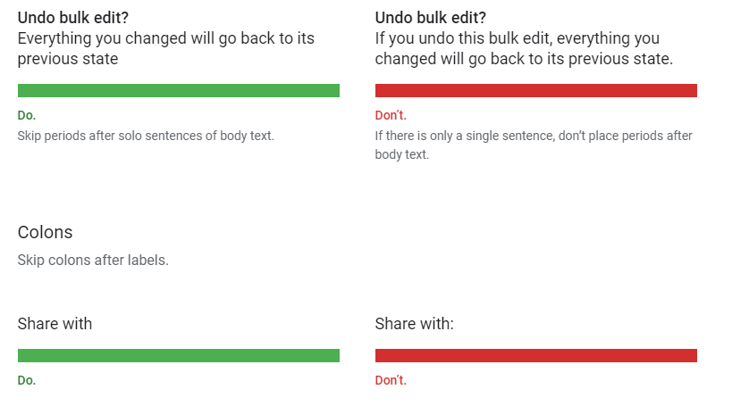
Written words stay longer than spoken ever can! And so it is important for you as a website designer to avoid extra punctuation so the reader can scan the text easily. The correct usage of punctuation helps in effective communication thereby reducing confusion. Hence it is advised to avoid using periods, colons etc. especially in body text and labels. A quick tip: If you need to use periods use them in longer sentences or sentences followed by links. For example:
Source: Material Design - Capitalization
Remember those days when in school the teacher wrote in ALL CAPS on the blackboard. Oh! how distracting it used to be. The same is true with websites. Capitalization can hamper the customers reading experience and might make either skip the page or the website altogether. By common behaviour, we try to use capital letters when we wish to impose either our wants or demands on someone. Not only this, but it also affects the reading quality as the words seem jumbled up. A quick tip is to use sentence case. This looks more pleasing to the eye and is also easier to read and understand. An example:
- Lack of User Focus
A lack of focus on the user makes the website less user-friendly and more product-centric. As a website owner, your priority is to make give attention to the user, for they are your potential customers. Imagine, if John F. Kennedy was a web designer instead of saying “…ask not what your country can do for you—ask what you can do for your country” he would say “ask not what the customers can do for you—ask what you can do for your customers.” For example:
Wrong Sentence: Your complaint has been registered. It will be reviewed internally and we will get back to you.This sentence doesn’t tell what you’re doing for the customer. It’s ambiguous and gives no specific information to the user about the issue at hand or the resolution process.Recommended Sentence: We’ve received your complaint and assigned a support executive who will get in touch with you within the next 4 hours to help resolve the issue.
Conclusion:
Just like we follow a minimalistic design approach to minimize clutter, it is equally crucial to follow a focused and clear content strategy on the website too. A clear, simple and direct approach to writing can be easily processed by users and in most cases motivates them to explore more.
If you have any comments or suggestions, feel free to drop them in the comments section below.
